Archives
Posts Tagged ‘visualization’
May 5, 2014
On Using Tools and Asking Questions
I recently met up with fellow EMiC fellow Nick van Orden, along with a few other colleagues here at the University of Alberta, to discuss our shared experiments in Gephi, “an open graph viz platform” that generates quick and lovely network visualizations. Our meeting was in turn prompted by an earlier off-the-cuff conversation about the pleasures and challenges of exploring new tools, particularly for emerging scholars for whom work that cannot be translated into a line on the CV can often feel like a waste of time. We agreed that spending some time together puzzling over a tool of mutual interest might reduce the time investment and increase the fun factor.
During this first meeting the conversation somewhat inevitably turned to the question of why — why, when there is such a substantial learning curve involved, when it takes SO LONG to format your data, why bother add all? What does a new tool tell me about my object of study that I did not already know, or could not have deduced with old-fashioned analogue methods?
I offer here an excerpt from Nick’s reflection on this conversation, because it is perfect:
DH tools don’t provide answers but do provide different ways of asking questions of the material under examination. I think that we get easily frustrated with the lack of “results” from many of these programs because so much effort goes into preparing the data and getting them to work that we expect an immediate payoff. But, really, the hard intellectual work of thinking up the most useful questions to ask starts once we’re familiar with the program.
The frustration with lack of results, like the frustration with spending time learning something you won’t necessarily be able to use, is based on an instrumentalist approach to academic work that suggests two related things. First, it is, I think, a symptom of the state of the academy in general and humanities in particular. Second, it implies that DH tools should function like other digital tools, intuitively and transparently. I say these points are related because often the instrumentalist approach to scholarship develops into an instrumentalist approach to DH as itself a means for emerging scholars to do exactly the kind of CV-padding that learning a new tool isn’t. And therein lies the value of this “hard intellectual work.”
To illustrate, here is an image of one visualization I produced from Gephi.
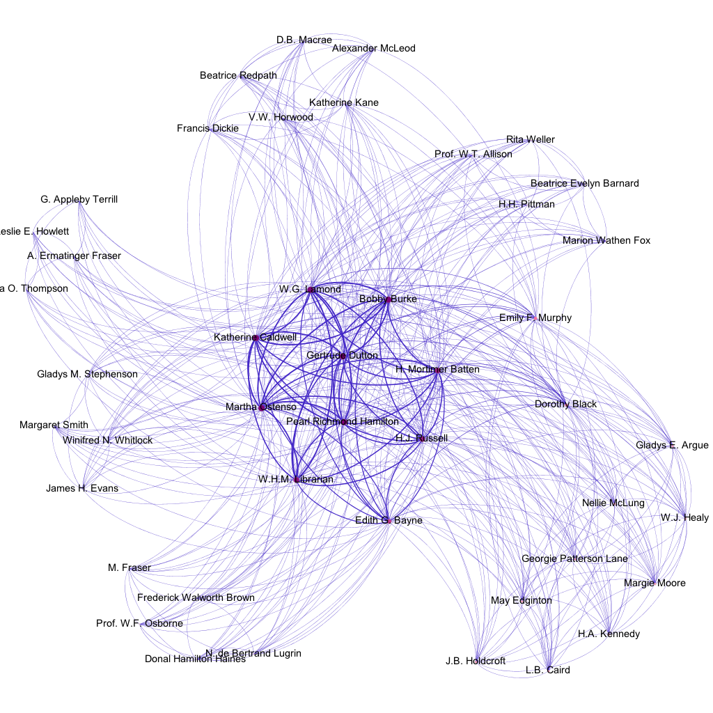
This image shows the authors featured in each of the six issues of the magazine Western Home Monthly in which Martha Ostenso’s Wild Geese was serialized between August 1925 and January 1926. It reveals a few things: that there a number of regular feature-writers alongside the shifting cast of fiction and article contributors; that, in terms of authors, different issues thus interweave both sameness and difference; that Ostenso herself briefly constitutes one of those recurring features that characterizes the seriality of the magazine, even if a larger chronological viewpoint would emphasize the difference of these six issues from any others. None of these points are surprising to me; none of them were even, properly speaking, revealed by Gephi. They were, in fact, programmed by me when I generated a GDF file consisting of all the nodes and edges I wanted my network to show.
This image does a much better job of arguing than it does of revealing, because it is based on the implicit argument I formulated in the process of building said GDF file: that a magazine can be understood as a network constituted by various individual items (in this case, authors) that themselves overlap in relationships of repetition and difference. It can thus, as Nick implies, be understood as the result of a series of questions: can a magazine be understood as a network? If so, a network of what? What kinds of relationships interest me? What data is worth recording? What alternate formulations can I imagine, as I better understand what Gephi is capable of?
Work like this is slow, exploratory, and its greatest reward is process rather than product. It may eventually lead to something, like a presentation or a paper, that can show up on a CV, but that is not its purpose. The greatest value of the painstaking work of learning a new tool is this very slowness and resistance to the instrumentalist logics of DH in particular and academic work in general.
What is your experience with learning new tools. What tools have you experimented with? How have you dealt with your frustrations or understood your successes? Do you think of tools as answering questions or helping you to pose better questions? Or as something else entirely?
June 9, 2012
DH Tools and Proletarian Texts
(This post originally appeared on the Proletarian Literature and Arts blog.)
I’m at the Digital Humanities Summer Institute at the University of Victoria this week. I’m taking a course on the Pre-Digital Book, which is already generating lots of interesting ideas about how we think and work with material texts, and how that is changing as we move into screen-based lives. There are, of course, many implications for how these differing textual modes relate to how we study and teach proletarian material, and more importantly, how class bears on these relationships. I hope to share some of these ideas as they have developed for me over the week. The course has taken up these questions in relation to medieval manuscripts and early modern incunablua and print, but the issues at stake are relevant for modern material as well. The instructors and librarians were kind enough to bring in a 1929 “novel in woodcuts” by Lynd Ward for me to look at – more on that will follow.
But, for fun, I also wanted to post about a little analysis experiment I did with some textual analysis tools.
I used the Voyant analysis tool to examine a set of Canadian manifesto writing. I transcribed six texts either from previous print publications or from archival scans for use as the corpus. These included: (1) “Manifesto of the Communist Parties of the British Empire”; (2) Tim Buck, “Indictment of Capitalism”; (3) CCF, “Regina Manifesto”; (4) Florence Custance, “Women and the New Age”; (5) “Our Credentials” from the first issue of Masses; and (6) Relief Camp Workers Strike Committee, “Official Statement”. [The RCWSC document remains my favorite text of all time.] Once applied, the tools let me read the texts in new ways, pulling out information or confirming ideas that I had about them in meaningful ways. You can find the summary of my corpus here.
The simplest visualization is the Cirrus word cloud, which at a glance shows that these texts are absolutely dominated by the language of class and politics (unsurprising, as they are aimed at remaking the existing class order). Michael Denning’s statement in The Cultural Front that the language of the 1930s became “labored” in both the public and metaphoric spheres is clearly reflected in this image.
 Cirrus visualization of Canadian manifesto texts
Looking at the differences among the materials, an analysis of distinctive words is a simple way to get at the position of a given text in relation to the others. We might think of these Canadian manifestos as occupying the same ground of debate (though they are not responding to one another directly), but not necessarily sharing the same tent. For example, the “Manifesto of the Communist Parties of the British Empire” shows a much higher concentration of the term “war”, which helps situate it to later in the 1930s. The “Regina Manifesto” is overwhelmingly concerned with the “public” as it plans for a collective society. Florence Custance’s feminist statement shows itself to be more unique in its own time, as it uses “women” and female pronouns far beyond the other texts. And the Masses text betrays its literary periodical background with its heavier use of “art”.
The density of vocabulary in the texts can tell us something about intended readerships, and purpose of the text. Masses plays with the linguistic conventions of the manifesto to develop a text that is both assertive and creative; accordingly, it uses the largest variety of words to do so. However, the RCWSC is not far behind in its forthright call to action, which tells me something interesting about the role of the imaginative mode in connecting revolution with creative acts. Buck’s “Indictment” is the least dense text. It’s also the longest, which makes for a highly repetitive text. The “Indictment” has a strong oral quality to it, commenting on Buck’s trial and defense and with response and Marxist analysis. It is also highly indebted to that style, parsing its terms minutely and using them for step-by-step explanations. It is in many ways the most didactic of the texts, as the word density suggests, though such analysis misses the purposeful element of the limited word choices. I find Buck’s repetition to have an incantatory quality connecting it more closely to spoken debate than the other texts, an impression that comes out of working with the text closely, while typing and re-typing, and reading it aloud for myself. Word density is not for me an assignation of value; rather, it is one of many ways of framing some thoughts on how these texts – and manifestos more broadly – employ particular rhetorical modes and how we can follow them through.
Here is the link to the Voyant analysis of my manifestos. I invite you to take a look, play around, and consider throwing up some text from other working-class and proletarian sources. It seems to me that a lot of textual analysis begins by reaching for “important” texts – those that are canonical, or historical. The tools make no distinction – I would like to see more examples of writing from below feeding into the ways we think about texts in the DH realm.
June 9, 2010
A Voyeur’s Peep] Tweet
To build on Stéfan Sinclair’s plenary talk at DHSI yesterday afternoon, I thought it appropriate to put Voyeur into action with some born-digital EMiC content. Perhaps one day someone will think to produce a critical edition of EMiC’s Twitter feed, but in the meantime, I’ve used a couple basic digital tools to show you how you can take ready-made text from online sources and plug it into a text-analysis and visualization tool such as Voyeur.
I started with a tool called Twapper Keeper, which is a Twitter #hashtag archive. When we were prototyping the EMiC community last summer and thinking about how to integrate Twitter into the new website, Anouk had the foresight to set up a Twapper Keeper hashtag archive (also, for some reason, called a notebook) for #emic. From the #emic hashtag notebook at the Twapper Keeper site, you can simply share the archive with people who follow you on Twitter or Facebook, or you can download it and plug the dataset into any number of text-analysis and visualization tools. (If you want to try this out yourself, you’ll need to set up a Twitter account, since the site will send you a tweet with a link to your downloaded hashtag archive.) Since Stéfan just demoed Voyeur at DHSI, I thought I’d use it to generate some EMiC-oriented text-analysis and visualization data. If you want to play with Voyeur on your own, I’ve saved the #emic Twitter feed corpus (which is a DH jargon for a dataset, or more simply, a collection of documents) that I uploaded to Voyeur. I limited the dates of the data I exported to the period from June 5th to early in the day on June 9th, so the corpus represents the #emic feed during the first few days of DHSI. Here’s a screenshot of the tool displaying Twitter users who have included the #emic hashtag:

#emic hashtag Twitter feed, 5-9 June 2010
As a static image, it may be difficult to tell exactly what you’re looking at and what it means. Voyeur allows you to perform a fair number of manipulations (selecting keywords, using stop word lists) so that you can isolate the information about word frequencies within a single document (as in this instance) or a whole range of documents. As a simple data visualization, the graph displays the relative frequency of the occurrence of Twitter usernames of EMiCites who are attending DHSI and who have posted at least one tweet using the #emic hashtag. To isolate this information I created a favourites list of EMiC tweeters from the full list of words in the #emic Twitter feed. If you wanted to compare the relative frequency of the words “emic” and “xml” and “tei” and “bunnies,” you’d could either enter these words (separated by commas) into the search field in the Words in the Entire Corpus pane or manually select these words by scrolling through all 25 pages. (It’s up to you, but I know which option I’d choose.) Select these words and click the heart+ icon to add them to your favourites list. Then make sure you select them in the Words within the Document pane to generate a graph of their relative frequency. If want to see the surrounding context of the words you’ve chosen, you can expand the snippet view of each instance in the Keywords in Context pane.
Go give it a try. The tool’s utility is best assessed by actually playing around with it yourself. If you’re still feeling uncertain about how to use the tool, you can watch Stéfan run through a short video demo.
While you’re at it, can you think of any ways in which we might implement a tool such as Voyeur for the purposes of text analysis of EMiC digital edtions? What kinds of text-analysis and visualization tools do you want to see integrated into EMiC editions? If you come across something you really find useful, please let me know (dean.irvine@dal.ca). Or, better, blog it!