Community
June 5, 2014
Visualizing the Landscape of Aboriginal Languages
I have spent the last few days in Scott Weingart’s class (scottbot.net) on Data, Math, Visualization, and Interpretation of Networks. We’ve been working on the basics of network analysis and learning some new lingo around networks and visualizations, such as nodes, vertexes, degrees, directed and undirected, weighted and unweighted edges. The tools we have being using, and the questions and discussions that have arisen in the class have been both practical and critical of the concept of network analysis, possible data bias, and semantic generalization. Nevertheless, we’ve forged on in our quest to create the most beautiful, eye-catching visualizations, and have I been able to see the possibilities in reading data differently through network visualization, and have a wider perspective on the concept of networks in general.
I came to the class without a particular project in mind, so once we started working on NodeXL, and I needed to insert data sets into the program, I sought out some data on the statscan site that I thought might be useful to interpret in relation to networks. I found some data related to Aboriginal languages in Canada from a study produced in 2011 and published in 2013: Aboriginal Languages in Canada. As the title of the table suggests, the data represents three main “nodes” – language, province, and concentration of population with regards to peoples with Aboriginal languages as a mother tongue. Although incomplete, the table does offer the possibility to map the data as a network across geopolitical borders to see where language groups could possibly meet at the edges. Here is the graph that was produced using the data from the survey:
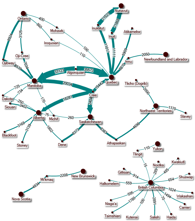
The main nodes on the graph are the different Aboriginal languages, and the provinces in which they can be found as of 2011. It is a directed graph, which simply means that the language nodes point to the different provinces to which they are connected by an arrow pointing in the direction of their presence. Some of the languages only point to one province, while others point to multiple provinces. The edges of the graph, the arrows themselves, indicate the population size of those that speak the language in relation to their concentration in the particular province to which the edge points. The graph offers a few possible readings, and a number of problems. It cannot really tell us anything about the historical relationship between the different languages because it is based on data compiled in 2011 about people living with a particular nation-state constructed through colonial practices. It tells us nothing about the linguistic relationship between or amongst the various languages, although it is possible to see that the concentration of Cree and Algonquian-speaking peoples could possibly have linguistic similarities due to their proximity (which is true, but not expressed by the graph specifically).
What the graph does tell us, which might not be made clear simply by reading the data table, is that there are in fact three networks of Aboriginal languages as expressed in the data. The largest network stretches geographically from Quebec to Alberta to the Northwest Territories. On either side, we get two distinct networks of Aboriginal languages that are isolated along the Atlantic and the Pacific. It is possible to read this visualization of the data beyond the numbers – or at least ask some questions about what it is showing us. Why exactly do the coastal nations exist in isolated spaces? Is it possible to argue that coastal dwellers had different social practices that made them less likely to travel far from the coast, and thus have less interaction with other groups? Does the topography of the landscape have an effect on the fact that Northwest Coast First Nations languages do not cross over into Alberta as of 2011? Or is it simply that the data is insufficient, and we are only able to see how colonial practices produced these isolated networks of linguistic speakers through forced assimilation and the reservation system? I’d be interested to hear what anyone thinks about the visualization, and if there are others questions that could be asked by looking at the networks of Aboriginal languages in Canada. Happy DHSI to all!
Marc, I think this is such a wonderful exploratory use of network visualization. I haven’t the knowledge (or “domain expertise”, seeing as we’re here at DHSI and that’s the lingo) to know how and whether these languages relate to one another, but I find the idea of exploring the relationship of indigeneous languages by using networks very compelling. There’s a map that I love which shows the rough distribution of Aboriginal languages across the Australian continent, and it’s a fabulous map because it does away with all the straight and artificial lines separating the Australian states that we are so familiar with, and offers a completely different way of understanding the different spaces that the country can be divided into (ie. Aboriginal language groups). The network diagrams offer yet another way of imagining the cultural spaces of the nation in a way that does away with the divisions imposed upon the country by the colonial invaders.