Community
November 11, 2014
A Thank You, A Confession, and a Digital Edition Prototype
I would like to start by thanking everyone for their cooperation over the past 14 months, during which time I pestered many of you to contribute to this blog and share updates on your EMiC projects. I have completed my term as social media intern for EMiC, and it has been a pleasure to work with all of you and see the wealth of exciting projects and valuable feedback that have been featured on EMiC’s social media outlets.
The confession part of this post is that I have not shared anything about my own (somewhat stalled) EMiC project during my time coordinating the blog. I started a digital edition project in my MA degree in 2012-13 with the hopes of having a completed website (bpnicholproject.ca) by the time I crossed the stage. The project was probably more ambitious than practical for a three-semester timeline, considering I began it with no clear idea of how I was going to get my ideas online. After realizing it would take more than a few Ladies Learning Code classes to create an interactive edition of selected bpNichol works myself, I sent out a call to Computer Science students at Dalhousie to see who I could hire as a web designer. The grad student I worked with was talented and capable, but also extremely busy with his own studies. Between our busy schedules and interdisciplinary communication difficulties (I may have learned helpful html, CSS, and JavaScript terms, but explaining the importance of bibliographic codes to a web designer is another thing), the project had a slow start. Once he finally had some prototypes for me, his server was hacked, the prototypes were lost, and he had to start over again. After redoing the pages he had previously created, he sent me all the necessary files for my own safe-keeping and politely admitted that he was too busy with his degree to continue.
Discouraged by my lack of finished product, I never really reported on these prototypes. With a full-time non-academic job, my project has been sitting on the back burner for a year and the guilt of not completing it prompted me to write posts about resources and cross-disciplinary tools but not actually write about my own project. So here is a long overdue post about where I ended up with two of the components of my digital edition, written with the hope that summarizing things “out loud” online will be the first step to setting things in motion once more.
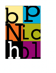
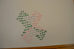
(Pictured above is my homepage graphic that is still homeless.)
One of my main intentions with creating a digital edition (in the form of a website) of selected bpNichol works is to preserve bibliographic characteristics and the materiality of texts that are so integral to Nichol’s concrete poetry. bp often created many versions of a single work, so I also wanted to incorporate genetic criticism into my approach. Since a bibliographic editing orientation does not allow any textual features to be overlooked, genetic analyses that adhere to a bibliographic orientation must avoid creating eclectic texts, which are texts produced by collating features from all existing versions and emended to produce a copy text that includes the “best” of these features. Eclectic texts are highly impractical for concrete poetry because there is no clear way of deciding which margin width or font size is the “best” since each of these material characteristics is dependent and intrinsically linked to individual versions, their media, and the contexts of their production. In other words, each version of one of Nichol’s poems is informed by the material characteristics of all preceding versions and the significance attached to those characteristics.
While genetic criticism best directs the reader’s study of Nichol’s poems, the standard form of annotations used for this critical orientation, which refers to spelling and word use variations in a coded list ordered by line number, does not provide adequate representation on the subtle variances in bibliographic characteristics. Since Nichol includes bibliographic codes as part of his poems’ aesthetic dimensions, the materiality of his work plays a major part in the movement of his writing. Many of his poems do not vary in content between versions, but their aesthetics change due to alterations in bibliographic code.
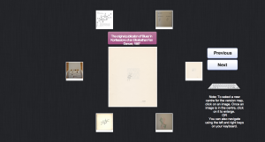
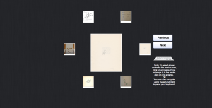
My digital edition resists linear presentation and integrates apparatus with content by using a dynamic template to display scanned images of all versions of a chosen poem. The user can move from image to image by selecting thumbnails from a wheel or cycling through images using the arrow keys or ‘previous’ and ‘next’ buttons. The selected image moves to the centre of the wheel, allowing an image that had previously assumed the position of textual apparatus for the centre text to become the copy text of the edition. This template allows the genetic portion of my digital edition to function as a sort of version map, where the eye can move from one version to the next in an image landscape, making visual connections in all directions. The genetic narrative of the writing and production processes that can be inferred from the differences between versions can be picked up and left off at any point, thereby de-emphasizing initial intentions and end results and instead offering readers the opportunity to perceive a work from the vantage point of any one of the texts that comprise that single work. Each image acts as an annotation to the rest, providing information about textual variants just as traditional genetic endnotes would while allowing each image to function as both copy text and textual apparatus.
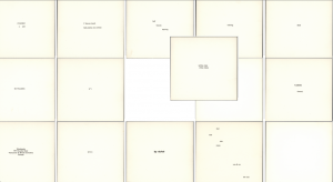
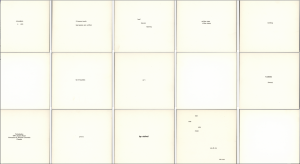
This screenshot shows the basic design of the version map.
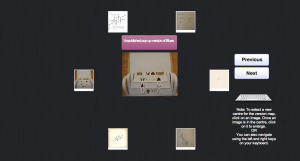
This screen shot shows the version gallery after another image has been selected as the centre image.
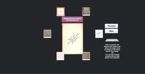
The scanned images maintain the visual bibliographic codes of the original texts, such as font, paper colour, spacing, and margins. However, they do lose other bibliographic characteristics such as paper weight and texture, context provided by format (i.e. whether the poem is printed in a book, journal, or non-codex format), and context provided by front and back matter and placement amongst other content. Another difficulty I have encountered is maintaining page size. The web designer I worked with last year was unable to create a gallery of images that works in the way I just described while also keeping the original page sizes and still making everything visible on a standard computer screen. Even the irregularity between the shapes and sizes of scanned images causes problems of overlap when certain images are in the middle of the wheel (as shown in the below screen shot). My intentions of preserving bibliographic codes in every way possible don’t jive well with web design conventions that lean toward uniform image sizes and shapes.
I have also debated how much to provide for textual annotations. The below screenshot shows the images with no textual annotation for the centre image, with only the other images acting as genetic annotations. However, I feel that some traditional textual annotation is necessary to provide context.
The other section of the digital edition I had mapped out that I worked on with a web designer was a simple interactive section involving the text Still Water.
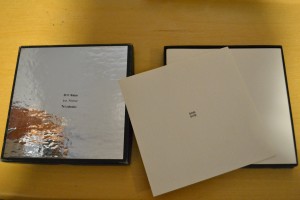
With traditional books, reader interaction is limited to turning the pages and reading the text, controlling the speed of reading but not much more. Readers could choose to read the pages out of order, but not without being aware of the definite sequence that is imposed upon the text by its bound format and page numbers. Nichol expanded these options first in his print material with works such as Still Water, which consists of twenty-eight cards in a box and could be shuffled and re-sequenced. In my digital-edition prototype of selected Nichol works, I focus on the potential to translate some of the original material characteristics of Still Water, particularly those that encourage interaction between the text and the reader, to a digital medium by making the collection available online.
This miniature archive of concrete poems printed on twenty-eight square cards in a box is difficult to find in its original form, and anthologies and critical editions that include excerpts from it lose key elements of the reader’s relationship with the text by re-printing the excerpts in a traditional codex format. Since Nichol did not number any of the cards, Still Water is not subject to any particular order, nor is it confined to a one-page-at-a-time presentation since the “pages” are not bound together. These features allow the reader to step in as editor of the text, arranging and re-arranging the poems. With no available record of the original order, readers cannot even be sure that the shape and flow of the text has not already been partially determined by previous readers. While there are cards with title, publication information, and dedication, the identities of text and paratext are blurred by such poems as “the blue pen i write these poems with,” which could be a stand-alone piece, a supplement to preceding or subsequent poems, or an author’s note about the production history of the text. Similarly, there are also three blank cards, which bear no marks to designate them as front or back matter, and which could be inserted throughout the body of the text in order to create pauses or indicate sections.
The interpretation of Still Water not only varies with its arrangement but also differs based on whether the reader views the work as a collection of individual poems or as a holistic whole comprised of parts with individual sub-narratives. The lack of binding and the perfectly square shape of the cards allow the reader to arrange them as a scene, in a four-by-seven rectangle, a two-by-fourteen column or any one of numerous irregular shapes, with juxtapositions and connections created by placing cards edge to edge. The scene can be read top-to-bottom, left-to-right, or as one large poem that draws the eye to its various quadrants and single cells based on the weight of words, groups of words, or absence of words.
Still Water re-invents the book as a collection of pages that allow content to be interpreted based on the relation of each page to all the others. With Still Water’s remediation of the book as a series of unbound cards, the authority that the book holds as a medium that directs the reader from the beginning to the end in a linear progression is transferred to the reader who can now direct the narrative flow of the text.
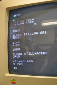
While at Lori Emerson’s Media Archaeology Lab at the University of Colorado in Boulder, I created five short programs for five different Still Water poems on the Apple IIe using Applesoft BASIC language (see above image). The programs were saved to a 5-¼-inch floppy and can be recalled by typing the commands LOAD STILLWATER1 (or STILLWATER2, STILLWATER3, etc.) and RUN. Hypothetically, if all twenty-eight units of content from the twenty-eight cards of Still Water were created as programs in BASIC programming language and saved to a floppy disk, any user could call up the “pages” of Still Water in any order that they choose. This concept is a good basis for what can be done with more complex programming language today. Using JavaScript and jQuery, it is possible to shuffle the Still Water cards. Readers can view the cards in one order and then, with a simple click, rearrange the order and re-view the content in any one of almost infinite permutations. Unlike the programs created with Applesoft BASIC, today’s programming languages also allow all twenty-eight cards to be visualized at once and dragged and dropped into different arrangements. Also, the original font, page shape, and paper colour can be maintained through the use of scanned images.
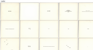
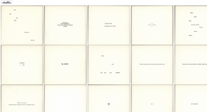
Here is a screen shot of the Still Water grid created by the web designer. One issue is that all 28 cards cannot be visible at once on a standard computer screen.
After hitting the “shuffle” or “filter” button, the cards will randomly re-order.
The reader/user can also click on individual “pages” and drag and drop them to reorder the poems as they wish.
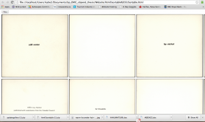
I was generally really pleased with how this interactive version of Still Water turned out, although I admit the text can be a bit hard to read. The web designer created another html file in which the images were larger, but I find that it loses some effect as only a few images are visible in the web browser at a time.
Since the screen shots don’t necessarily illustrate the above concepts as well as I would like them to, I had hoped to be able to attach html files for you to open in your browsers, but that doesn’t seem to be possible on Word Press. If anyone would like to test out either of the components of my digital edition that I have featured here, I would be happy to email html files, and I am always happy to receive feedback. I hope to have more to share in the future as I continue to work on this project in my spare time.
