Community
June 8, 2014
Tool Tutorial: Out-of-the Box Text Analysis
This year at DHSI — my third and perhaps last round of it — I took Out-of-the-Box Text Analysis for the Digital Humanities, taught by NYU’s David Hoover. This class deepened my understanding of the way digital tools can enhance traditional ways of reading and analyzing texts. Using the Intelligent Archive Interface (a text repository developed at NYU and downloadable at http://www.newcastle.edu.au/research-and-innovation/centre/education-arts/cllc/intelligent-archive), as well as Minitab, Microsoft Excel (with a number of additional macros from Hoover), and some basic TEI, we explored largely comparative ways of answering questions about authorship attribution, textual and authorial style, and meaning, based largely on word frequency. The results of these analyses were visualized using dendrograms, cluster graphs, and loading/score plots.
Here’s a walk-through of one of the basic methods we learned of creating and visualizing a comparative analysis of the most frequently-used words in different texts.
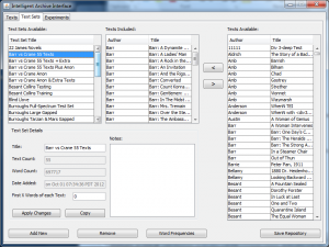
First, open the Intelligent Archive. In our class, we used a version populated with a number of plain-text novels, short stories, and poems edited by David Hoover. Go to “Text Sets” and either select an existing set of texts to compare, or create a new set. To create a new set out of new texts, go to the “Texts” tab, “Add New,” browse for your file(s), and add them to the repository. Give your new text set a title and add your new texts to it using the left-pointing arrow. Here, texts from 19th-century authors Stephen Crane and Robert Barr are being compared under the text set title “Barr vs Crane 55 texts.”
Once you have the text set ready for comparison, click on “Word Frequencies,” and choose the proper parameters for your comparison. Different selections provide slightly different results: the “BlockBigLast” selection divides the text into chunks and places any extra in one last large chunk. You can also select “Text Divisions” if you’ve marked divisions (ie. for chapters) in the plain text file you’re working on. Choosing “Text” will simply compare the entire texts against one another. “Words Having Highest Frequency” is the selection for charting the most frequently-used words across the indicated chunks of text. Other possible selections are “Inclusion words” selections (sorted or unsorted): entering particular topical keywords that you’d like to track in the “Words to Include in Process” box includes only these keywords in the analysis. The output size is the number of most frequent words (or least frequency words, or words with highest hits [that is, words occurring in most sections of the text, but not most frequently overall]) you’ll be using. 1000 is the highest word count that can be used in Minitab. Finally, select “WordTypes” to make sure you’re analyzing words.
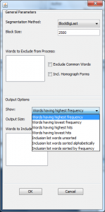
Once you’ve made your parameter indications, click OK. This will generate a text segment list, which displays the number and proportion of times the most frequent words occur in same-size chunks of each text.
Change the output type to “Show Proportions” (this gives you the percentage occurrence of word frequencies). Select all the data with the “Select all” button, and then click on “Copy to Clipboard.” Next, paste the segment output into a plain Excel spreadsheet, transpose it so that the texts run down the side and the words across the top; and run a find and replace to change any apostrophes to carats (apostrophe seem to throw things off).
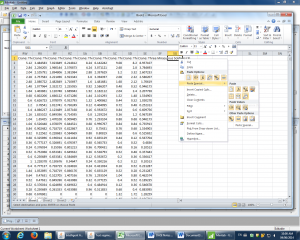
Copy this transposed spreadsheet into Minitab.
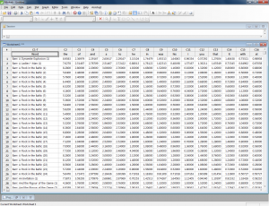
In this new Minitab worksheet, go to “Stat” in the toolbar, choose “Multivariate,” and then “Cluster Observations.”
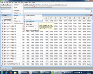
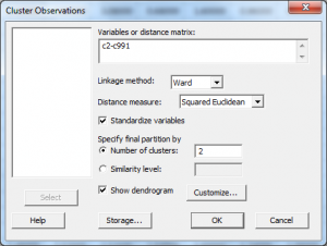
Under “Cluster Observations,” set the parameters to measure as many of the words as desired (words are listed down the left-hand side; these disappear once the range is selected). For example, c2-c991 captures the 1st to 990th most frequently used words. Select “Ward” as Linkage Method, “Squared Euclidean” as the Distance Measure, and click “Standardize Variables” and click “Show Dendrogram.” The cluster number should be appropriate to what is being compared; here, there are two authors being compared, so I’ve selected two major clusters.
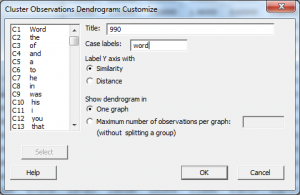
Under “Customize,” give the dendrogram a title, and put in “word” as the case label. Here, the title indicates the measure of 990 most frequent words.
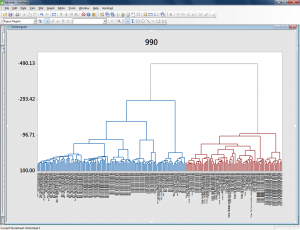
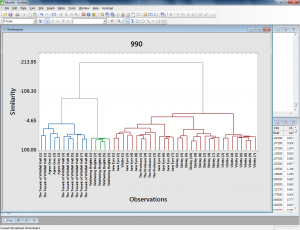
Click OK and OK again and the dendrogram appears. If desired, right-click on the titles along the bottom and go to “Edit X Scale” to make the font smaller, and change the alignment to 90 degrees for easier reading.
This dendrogram visualizes a comparison in which all the Barr texts group together in the blue cluster, while all the Crane texts groups together in the red cluster. This means that these two authors can be easily distinguished based on the most frequent 990 words they use.
In this example, a similar analysis of a number of texts by the Bronte sisters reveals that certain parts of their novels group with one another stylistically. The beginnings of their novels are especially similar — often, beginning sections are more similar in terms of word choice to other beginning sections of other novels than they are to the rest of the same novel.
I also used this tool to measure the most frequently-used words in approximately 30 randomly-selected letters George Whalley wrote to his family between 1927 and 1956. In this case, I created a plain text file of all the letters, divided into individual letters using simple TEI headings. I indicated in the text set dialog that I want these divisions to be compared by selecting “Text Divisions” under Segmentation Method and inputting the division type (I only used one type of division to divide each letter, so I chose div1).
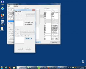
Then I followed the steps of changing the text segment display mode to proportions, selecting it all and copying to clipboard, pasting into Excel, transposing, replacing apostrophes with carats, and copying and pasting into Minitab. I used the usual parameters for Cluster Observations display.
The resulting Whalley dendrogram shows that a certain period of letter-writing is definable as using words differently than the others. These are a group of letters later in Whalley’s life (letters 24 to 29 of 31); however, the two letters that follow these are grouped with earlier letters (letter 30 is most closely aligned with letter 1, surprisingly, and letter 31 aligns most closely with letter 19).
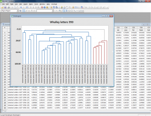
I’m not quite sure what, if anything, to conclude from this visualization. It seems to me that this particular tool can be useful in indicating differences in style that need to be explored further through more traditional methods like close reading and research into historical context – for example, maybe a particular project Whalley was working on in the 1950s made its way into a number of letters. The dendrogram/word frequency analysis doesn’t show us this, but could point us towards it (if we didn’t already recognize it through reading the letters).
I would most recommend a tool like this for exploring authorship attribution or for very preliminary exploration of how certain topical keywords are used across a body of work. David Hoover is extremely well-read and a wonderful instructor, and I would also recommend his class to anyone interested in that kind of work.
Another DHSI, another tool learned!
[…] Fletcher (Queen’s University), “Tool Tutorial: Out-of-the-box Text Analysis,” Editing Modernism in Canada, June 8, […]